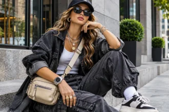

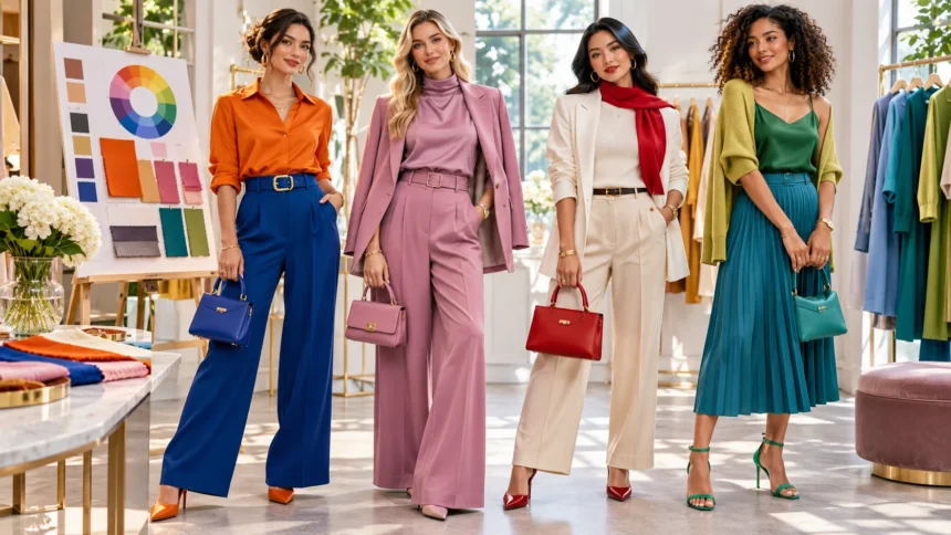
Choosing the right colors can make everyday dressing easier and more enjoyable. Whether you love neutral outfits, bright clothing, or soft pastel shades, understanding fashion color theory helps you create coordinated looks with confidence. Colors can influence how an outfit appears, how different clothing pieces work together, and the overall style you want to express. However, you do not need professional fashion knowledge to combine colors successfully.
Fashion color theory provides simple principles for matching clothing, selecting accessories, and experimenting with different shades. From complementary colors to monochromatic outfits, these ideas can help you make better use of your wardrobe. This guide explains the basics of color theory in fashion, popular outfit color combinations, and practical styling tips for creating comfortable, attractive looks.
What Is Fashion Color Theory?
Fashion color theory is the study of how different colors relate to one another when used in clothing and accessories. It draws on the color wheel, color harmony, contrast, and visual balance. These concepts help explain why certain combinations feel connected while others create stronger contrasts. Understanding them provides a useful foundation for experimenting with personal style.
The basic color wheel organizes colors according to their relationships. Red, yellow, and blue are traditionally described as primary colors in the familiar artist’s color wheel. Secondary colors include orange, green, and purple, which result from combining primary colors. Designers also consider variations in brightness, saturation, and temperature when creating clothing combinations.
Fashion color theory is a guide rather than a collection of strict rules. Different colors can work together in many ways depending on fabric, texture, lighting, and personal preference. An unusual combination may look appealing when styled thoughtfully. Learning color relationships helps you make intentional choices without limiting your creativity.
Why Color Theory Is Important in Fashion
Color theory helps simplify the process of choosing clothing that works well together. Instead of guessing which pieces to combine, you can use basic color relationships as starting points. This makes it easier to coordinate shirts, trousers, jackets, shoes, and accessories. Understanding color combinations can also make everyday wardrobe planning more efficient.
Another benefit is the opportunity to create different styles using familiar clothing. A neutral outfit can feel understated, while adding a contrasting accessory introduces more visual interest. Bright combinations may create a playful appearance, and softer shades can produce a quieter effect. These differences allow you to express your preferences through color.
Color knowledge may also help you make more practical shopping decisions. Before purchasing a new item, consider which existing pieces it could complement. A versatile color can create several outfit combinations without requiring additional purchases. This approach supports a flexible wardrobe while reducing the likelihood of buying clothing that rarely gets worn.
Understanding the Fashion Color Wheel
The color wheel is a circular arrangement that shows relationships between different colors. It provides a visual reference for identifying contrasting and similar shades. Fashion styling often uses the wheel to explore complementary, analogous, and triadic combinations. Understanding these arrangements makes experimenting with clothing colors easier.
Colors positioned near one another on the wheel generally share related visual characteristics. For example, blue, blue-green, and green create a connected sequence. Colors positioned opposite each other produce stronger contrast. Both approaches can work in clothing depending on the appearance you want to create.
The color wheel does not include every shade found in fashion. Colors such as beige, brown, cream, and gray are often treated as neutrals in wardrobe styling. Different shades also vary in brightness and intensity. Considering these differences helps you create more varied combinations than relying only on the basic wheel.
Primary, Secondary, and Tertiary Colors in Clothing
Primary colors are the foundation of the traditional artist’s color wheel. Red, yellow, and blue are often used to explain basic color relationships. In fashion, these colors can appear in both bright and muted forms. A navy jacket, burgundy sweater, or mustard shirt offers a different appearance from a highly saturated primary shade.
Secondary colors include orange, green, and purple. These colors create additional possibilities for clothing combinations. Olive trousers, lavender blouses, and rust-colored accessories are familiar examples of secondary color families. Their different tones can complement neutral outfits or become the main feature of a coordinated look.
Tertiary colors are combinations of neighboring primary and secondary colors. Examples include yellow-green, blue-green, and red-orange. Fashion designers use many variations of these shades in seasonal collections. Learning to recognize color families can help you coordinate clothing even when two items are not exactly the same shade.
1. Monochromatic Outfits for Simple Styling
Monochromatic styling involves creating an outfit using different shades, tints, or tones of one color family. For example, a navy shirt, medium-blue trousers, and pale-blue jacket can create a coordinated appearance. The colors are related without being identical. This makes monochromatic outfits useful for simple everyday styling.
You can create monochromatic combinations using neutral or colorful clothing. An all-beige outfit might include a cream sweater, tan trousers, and brown accessories. A green combination could include olive trousers and a soft sage top. Using different shades helps prevent the outfit from looking completely uniform.
Texture can also add visual interest to monochromatic clothing. Consider combining knitted fabric, denim, cotton, or linen within the same color family. These differences create variation even when the colors remain similar. Monochromatic styling is particularly useful when you want a coordinated outfit without managing several contrasting shades.
2. Complementary Colors for Eye-Catching Outfits
Complementary colors appear opposite one another on the traditional color wheel. Common examples include blue and orange, red and green, and yellow and purple. These combinations create noticeable contrast because the colors are visually different. They can be useful when you want clothing or accessories to stand out.
For a simple complementary outfit, pair a navy top with a muted orange scarf or handbag. The contrast introduces interest without requiring extremely bright colors. Another option is wearing a soft purple blouse with mustard-colored accessories. Adjusting color intensity allows you to create combinations that suit your preferences.
You do not need to use complementary colors in equal amounts. One shade can dominate the outfit while the opposite color appears in a small accessory. This approach is often easier when experimenting with stronger contrasts. A neutral item can also help connect the combination and create a more understated appearance.
3. Analogous Colors for Coordinated Looks
Analogous colors sit next to one another on the color wheel. Examples include blue, blue-green, and green or yellow, yellow-orange, and orange. These shades share visual similarities, making them useful for creating connected outfits. Analogous styling can introduce several colors without producing extremely strong contrast.
For a casual outfit, combine a light-blue shirt with teal accessories and dark-green trousers. The colors belong to neighboring families and can create an interesting coordinated appearance. Another idea is pairing a peach blouse with rust-colored accessories. Choosing different tones helps keep the combination practical for everyday wear.
When using three analogous colors, consider allowing one shade to remain dominant. The other two can appear in smaller clothing pieces or accessories. This creates variety without making the outfit feel overly complicated. Analogous color schemes are especially useful when you enjoy colorful fashion but prefer a connected overall appearance.
4. Triadic Color Combinations in Fashion
Triadic color schemes use three colors spaced approximately equally around the color wheel. A classic example includes red, yellow, and blue. Another combination uses orange, green, and purple. These arrangements provide noticeable variety and can create expressive clothing combinations.
Wearing three strong colors together may feel challenging for beginners. A practical approach is selecting one main color and using the other two as smaller accents. For example, a blue outfit might include a muted red handbag and a mustard accessory. This introduces contrast without requiring every item to be equally noticeable.
You can also choose softer versions of the three colors. Muted shades often create a different effect from highly saturated combinations. Consider the clothing’s fabric, pattern, and overall style before selecting accessories. Triadic styling is an opportunity to experiment rather than a requirement to wear three bold colors at once.
5. Neutral Color Combinations for Everyday Wear
Neutral colors are among the easiest choices for building a versatile wardrobe. Black, white, gray, beige, cream, brown, and navy are commonly used as neutral styling foundations. These shades can complement one another or support brighter accessories. Their flexibility makes them useful for casual, professional, and formal clothing.
For a simple neutral outfit, pair a white shirt with beige trousers and brown shoes. Another option is a gray sweater with black jeans and a matching handbag. These combinations do not require complicated planning. Different textures can add interest when the overall palette remains understated.
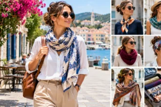
Neutral outfits also provide opportunities to introduce one colorful accessory. A green scarf, red handbag, or blue jacket can create contrast against simple clothing. You can change the accessory to create a different appearance using the same basic outfit. This approach is practical for people who want variety without maintaining an extensive wardrobe.
6. Warm Colors vs. Cool Colors in Fashion
Warm colors generally include red, orange, yellow, and related shades. They can create lively, energetic visual effects in clothing combinations. Cool colors often include blue, green, and violet. These groups are useful for understanding color relationships, although individual shades can contain both warm and cool influences.
Warm-toned outfits might combine rust, mustard, camel, and cream. Cool-toned combinations could feature navy, teal, lavender, and gray. Both approaches can create coordinated appearances. The overall impression depends on the specific shades, materials, and proportions used.
Mixing warm and cool colors is also a valid styling choice. For example, a blue shirt can complement brown trousers or warm-toned accessories. The contrast may create additional visual interest. Rather than following strict temperature rules, experiment with combinations that feel comfortable and suit your preferred style.
7. How to Match Bright Colors Without Clashing
Bright clothing can add personality and energy to everyday outfits. However, combining several saturated colors may require thoughtful coordination. Begin by selecting one noticeable color as the main feature. Other clothing pieces can provide contrast or create a quieter background.
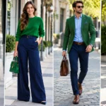
For example, pair a bright green shirt with navy trousers and white sneakers. The neutral elements allow the green shade to stand out. Another option is wearing a vibrant pink blouse with gray trousers. These combinations are simple ways to introduce color without relying on several bold accessories.
If you enjoy wearing multiple bright shades, consider their relationships on the color wheel. Complementary and analogous combinations can provide useful starting points. You can also experiment with different proportions to create balance. Fashion rules are flexible, so choose arrangements that reflect your personality rather than avoiding expressive color combinations.
8. Pastel Color Outfit Ideas
Pastel colors are lighter, softer versions of familiar color families. Common examples include pale pink, lavender, mint green, baby blue, and soft peach. These shades can create gentle, coordinated outfits. They are often associated with spring fashion but can be worn throughout the year.
For a simple pastel outfit, combine a pale-blue shirt with cream trousers and light-gray accessories. Another option is pairing a lavender sweater with white jeans. These combinations allow pastel colors to remain noticeable without creating strong contrast. Neutral footwear can help complete the look.
You can also mix several pastel shades within one outfit. Mint green and soft pink may provide a playful combination, while lavender and pale blue create a quieter appearance. Consider using different fabric textures to add variety. Pastel styling works well when you want color without highly saturated clothing.
9. How to Match Colors With Denim
Denim is a versatile wardrobe material that complements many different color combinations. Blue jeans can work with neutral shirts, bright tops, and patterned clothing. Their familiar appearance makes them useful for experimenting with fashion color theory. Different denim washes also create different visual effects.
Light-wash jeans often pair comfortably with white, beige, pastel, and darker clothing colors. Dark denim can complement both soft and vibrant shades. For example, dark-blue jeans may work with a rust sweater or pale-pink shirt. Choosing the right combination depends on your overall styling preferences.
Denim jackets can also help connect different clothing colors. A blue denim jacket may complement black trousers and a white shirt. Alternatively, it can provide contrast against a colorful dress. Denim’s versatility makes it a practical starting point when learning to coordinate outfits.
10. How to Use Accent Colors in Outfits
An accent color is a shade used in smaller amounts to add visual interest to an outfit. It often appears in accessories such as handbags, shoes, belts, scarves, or jewelry. Accent colors can help transform simple clothing combinations. They are particularly useful when your wardrobe contains many neutral pieces.
For example, a black-and-white outfit can be refreshed with a red handbag. A beige dress may complement a green scarf or blue shoes. The accent color becomes a noticeable detail without dominating the entire combination. You can also repeat it in another small accessory to create a connection.
Accent styling allows you to experiment with unfamiliar colors before purchasing larger clothing pieces. A colorful bag or scarf may be easier to combine than an entirely new outfit. This approach also supports wardrobe versatility. Small accessories can provide several different appearances using the same basic clothing.
11. Understanding Color Contrast in Fashion
Color contrast refers to the visual difference between two or more shades. High-contrast outfits use colors that differ noticeably in brightness, hue, or intensity. Black and white provide a familiar example. Lower-contrast combinations use shades that appear more similar, such as beige and cream.
A high-contrast outfit might combine a white shirt with black trousers and a dark jacket. This creates clear separation between clothing pieces. A lower-contrast combination could feature a cream sweater with light-beige trousers. Both approaches can look attractive depending on your preferences.
Contrast can also be created through accessories, prints, and textures. A bright handbag may stand out against a neutral outfit. Similarly, a dark belt can introduce definition to a light-colored dress. Understanding contrast helps you create different visual effects without needing to follow one specific fashion style.
12. How to Mix Patterns and Colors
Patterns provide another opportunity to explore color relationships in clothing. Stripes, checks, floral prints, and geometric designs often contain several shades. Coordinating patterned pieces becomes easier when you identify their dominant colors. You can then choose accessories or additional clothing that relates to those shades.
For example, a floral blouse containing blue and green may complement navy trousers. A striped shirt can work with plain clothing that repeats one of its colors. This approach creates a connection between patterned and solid pieces. It is particularly useful for people who are new to mixing prints.
Combining multiple patterns is also possible when the colors or design scales relate to one another. A small patterned accessory may complement clothing with a larger print. However, you do not need to mix patterns to create an interesting outfit. Simple combinations can be equally effective and easier to manage.
13. How to Choose Accessory Colors
Accessories play an important role in fashion color theory because they connect different parts of an outfit. Shoes, handbags, belts, jewelry, and scarves can introduce complementary or contrasting shades. Choosing their colors thoughtfully helps create a coordinated appearance. Exact matching is optional rather than necessary.
For a simple approach, select accessories that relate to one of the main clothing colors. A brown handbag may complement beige trousers, while black shoes can connect with a dark jacket. Neutral accessories provide flexibility across different outfits. They are especially useful when building a small, practical wardrobe.
You can also use accessories to experiment with stronger colors. A colorful scarf may introduce contrast to an otherwise neutral outfit. Metallic accessories such as gold and silver can add another visual element. Consider the overall combination rather than treating every accessory as a separate decision.
14. How to Build a Color-Coordinated Wardrobe
A color-coordinated wardrobe makes it easier to create outfits using fewer clothing pieces. Begin by reviewing the colors you already wear frequently. Identify neutral foundations and favorite accent shades. This provides a starting point for choosing future clothing and accessories that work with existing items.
You might select two or three main neutral colors and several additional shades that you enjoy. For example, navy, cream, and gray could form a foundation, with green and burgundy as accents. These colors can be combined in different ways. However, there is no requirement to limit your wardrobe to a fixed palette.
Before purchasing new clothing, consider how many existing pieces it could complement. A jacket that works with several shirts and trousers may provide greater flexibility. Comfort, fabric quality, and personal preferences should remain important. Color coordination is most useful when it supports your lifestyle rather than restricting your choices.
15. Seasonal Color Ideas for Everyday Fashion
Seasonal fashion often highlights different color families, but these associations are flexible. Spring collections frequently include pastels and fresh green shades. Summer clothing may feature brighter colors and light neutrals. These choices often reflect seasonal moods and available fabrics rather than strict styling requirements.
Autumn outfits commonly feature earthy colors such as rust, olive, mustard, camel, and brown. Winter wardrobes often include deeper shades such as navy, burgundy, forest green, and charcoal. However, bright clothing can work in winter, and darker colors can be worn in summer. Practical weather considerations matter more than traditional seasonal color rules.
You can adapt seasonal colors through accessories without replacing your wardrobe. A warm-toned scarf may refresh a neutral autumn outfit, while a pastel handbag can introduce spring-inspired color. This approach provides flexibility and reduces unnecessary purchases. Choose colors that you enjoy wearing throughout the year.
16. Common Fashion Color Matching Mistakes to Avoid
One common mistake is assuming that every clothing item must match perfectly. Exact color matching can create a coordinated appearance, but complementary shades and contrasts may be equally attractive. Overly strict matching rules can limit creativity. Experimenting with different color relationships often produces interesting results.
Another mistake is focusing only on color while overlooking fabric, fit, and comfort. Even a carefully coordinated outfit may feel impractical if the clothing does not suit your activities. Different materials also influence how colors appear. Considering these factors helps create combinations that work in everyday situations.
Some people also purchase colorful clothing without considering how it relates to their existing wardrobe. This can result in items that are difficult to combine. Before buying, imagine several possible outfits using pieces you already own. Thoughtful shopping helps create a more flexible wardrobe without requiring complicated color restrictions.
Conclusion
Fashion color theory provides a useful foundation for creating coordinated and expressive outfits. Understanding the color wheel, complementary colors, analogous shades, and monochromatic styling can make clothing combinations easier. Neutral colors offer versatility, while brighter shades create opportunities for contrast. These concepts help you experiment with fashion without depending entirely on temporary trends.
Successful color styling also involves considering textures, patterns, accessories, and personal preferences. You can use accent colors to refresh simple outfits or combine related shades for a connected appearance. Exact matching is not necessary, and unusual combinations can work when styled thoughtfully. The most important goal is creating clothing arrangements that feel comfortable and enjoyable.
You do not need professional fashion experience or an extensive wardrobe to use color theory effectively. Begin with simple combinations, experiment with different shades, and observe which arrangements you prefer. Over time, understanding color relationships can make everyday dressing more creative and convenient. With these easy styling tips, you can develop a personal approach to color that reflects your interests and lifestyle.
Frequently Asked Questions
What is color theory in fashion?
Fashion color theory explains how different colors relate to one another in clothing and accessories. It uses concepts such as complementary, analogous, and monochromatic color combinations to support coordinated styling.
What are the easiest colors to match in outfits?
Neutral colors such as black, white, beige, gray, brown, and navy are versatile starting points. They complement many different shades and make it easier to create everyday clothing combinations.
What is the three-color rule in fashion?
The three-color rule is a styling suggestion that encourages using approximately three main colors in an outfit. It can simplify coordination, but it is not a requirement for attractive clothing combinations.
How do you match complementary colors in clothing?
Choose colors positioned opposite each other on the traditional color wheel, such as blue and orange. Use one as the main shade and the other as an accent for manageable contrast.
Can you mix warm and cool colors in one outfit?
Yes, warm and cool colors can work together effectively. Combining shades such as navy and rust or blue and brown can create visual contrast while maintaining a coordinated appearance.